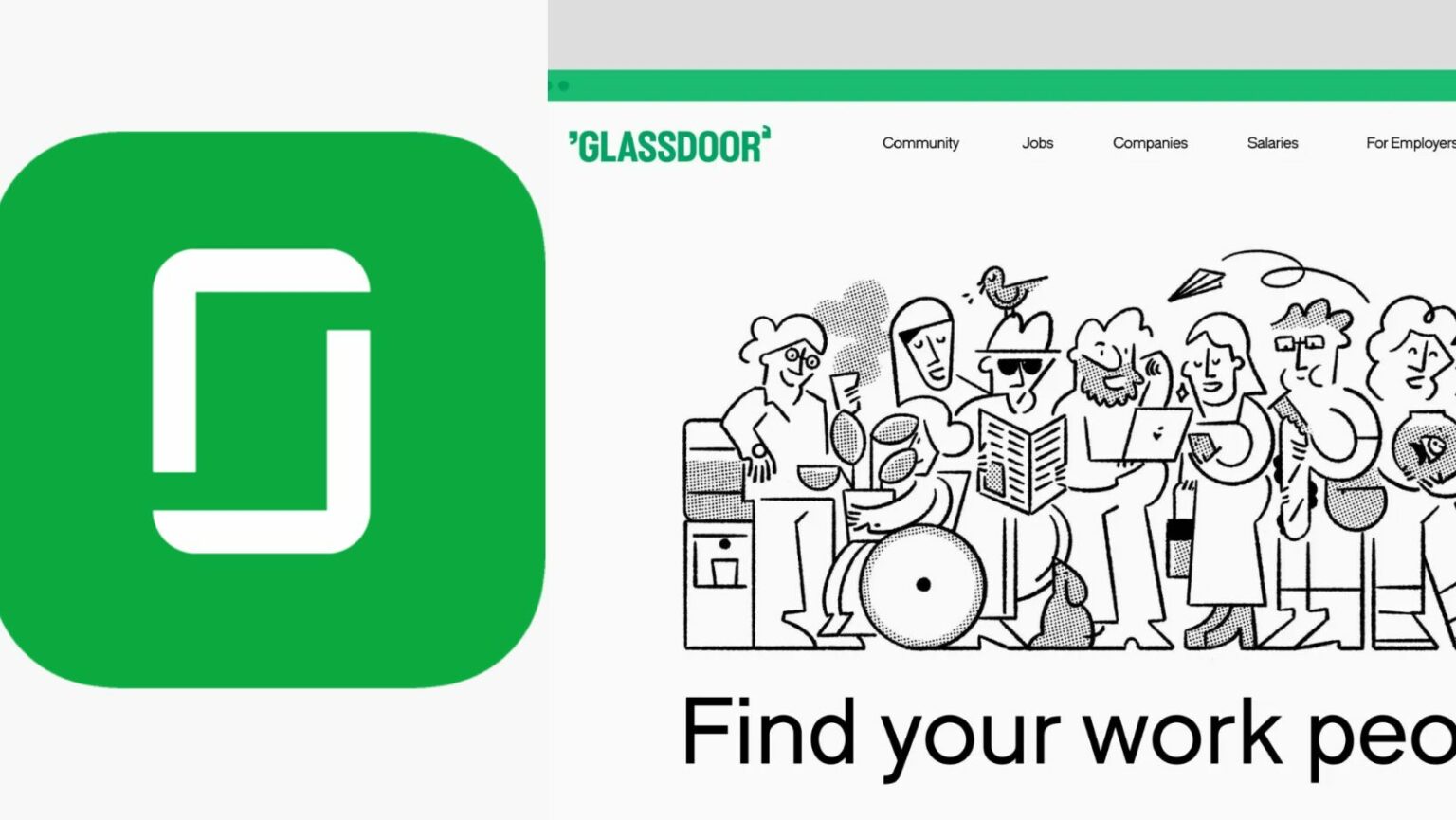
In a bid to reinforce its positioning of ‘real work talk’, Glassdoor, a leading job search and career insight platform, has introduced a new logo and overhauled its brand identity. The company collaborated with Koto, a renowned brand and digital studio, to shift from being solely an insight-driven platform to one that fosters a community for frank workplace discourse between employers and employees.
The updated logo encapsulates the essence of ‘real work talk’, positioning the brand name as the focal point of workplace discussions. It features g/d-shaped quotations on either side of the wordmark, symbolizing dialogue. In a marked departure from the past, the logo utilizes all-caps typography, representing a door swinging open in animation.
Also Read: RuPay Card Issuance Exceeds 10,000 in Bhutan, Boosting Digital Financial Inclusion
Koto stated, “‘Together, we built a holistic brand that exudes confidence and open-mindedness, amplifying users’ voices through transparent conversation.”
In pursuit of community-building, Koto worked with graphic designer Josep Puy to craft a ‘playfully sophisticated’ illustration library. The illustrations are designed to embody key themes such as diversity, anonymity, collaboration, conversation, and marketing.
The inspiration behind Glassdoor’s revamped brand identity comes from an incident where employee salaries were accidentally left on a copier machine, bringing transparency to the forefront. Koto emphasized that this incident influenced their strategic and verbal work, making ‘real conversations and insights’ a part of the brand’s tone.
Koto also refined Glassdoor’s iconic green color and developed a secondary color set, inspired by office copier papers and the diverse voices within the Glassdoor community, enhancing the digital product experience.
The next step was a transformation of Glassdoor’s typography, an integral part of the product experience. Koto created a custom typeface and a collection of interactive icons to accompany the wordmark, humanizing the product.
Being an information-intensive platform, Glassdoor focused on providing its members with a straightforward approach to data visualization. The revamped brand system brings the most critical data to life through innovative infographics, illustrative storytelling, and a motion system inspired by the product experience.
The rebranding move aligns with the trend of classic brands undergoing a revamp to resonate with a modern audience. One such instance is Warner Bros. Discovery’s rebranding of its children’s TV channel Boomerang to Cartoonito in Southeast Asia, Taiwan, and Hong Kong.
This news is based on Marketing Interactive.


